
Missouri Bicentennial Communications/Brand Identity Campaign
This campaign was designed as part of a graphic design class during Missouri’s Bicentennial Celebration. Various communications comprised the campaign. But I started with the logo, and moved on to poster communications.
Logo Design
Logo design was comprised of green and blue waves. This signifies the green rolling hills of Missouri and the many waterways. The wheel has the look of a traditional Captain’s steering wheel. And it also is reminiscent of an old trade union logo. I used this to signify the work ethic of the population in so many industries. Plus the captains wheel shows the State moving forward into the future.
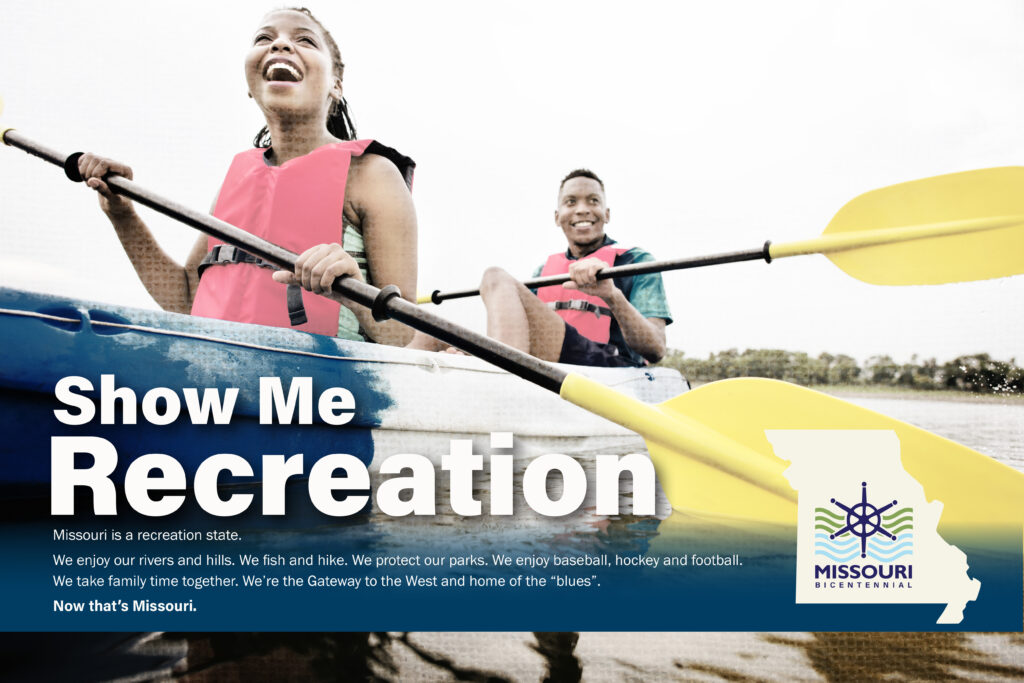
Bicentennial Poster Design: Show Me Recreation
Poster design focused on the great recreation opportunities outdoors and on the waterways for residents and visitors.
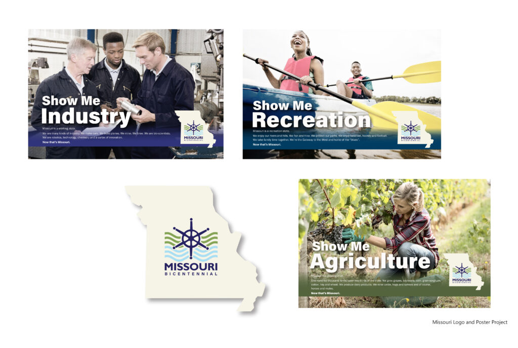
Bicentennial Poster Designs: Horizontal Versions
Themes of “Industry”, “Recreation” and “Agriculture” follow the colors in the logo on the state silhouetted background.
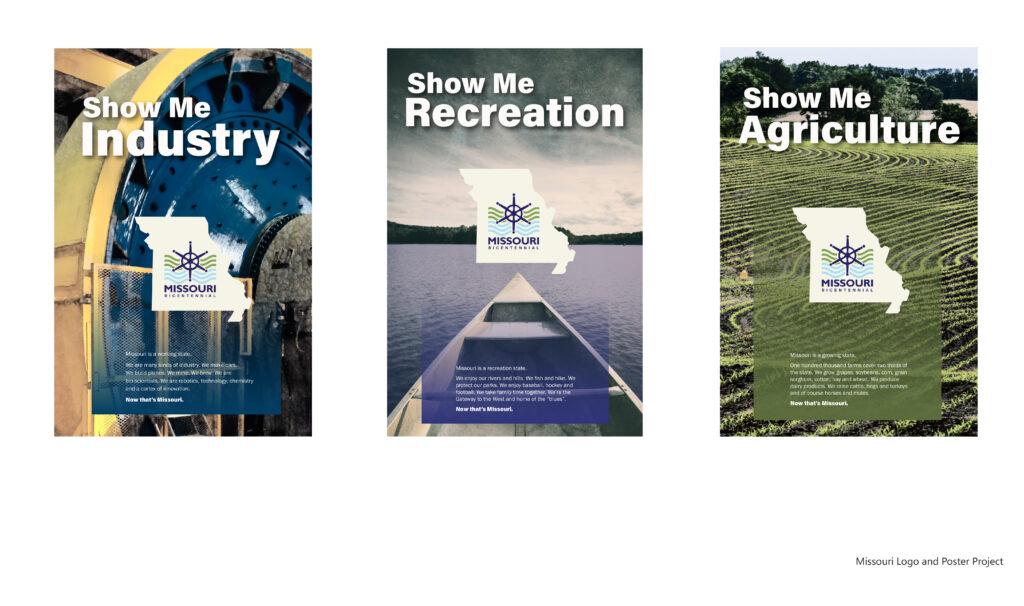
Bicentennial Poster Designs: Vertical Versions
These themes focus on the main elements of the logo: The “Industry” wheel, the “Recreation” on the blue waterways and the “Agriculture” throughout the green rolling hills.
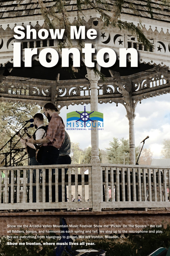
Missouri Bicentennial Poster
This was part of a project for a graphic design class. We were to create a logo for the Missouri Bicentennial and a poster campaign to promote various cities in Missouri. I took the photo of this band playing at the Arcadia Valley Mountain Music Festival. I used Photoshop to add a rustic effect to the photo to enhance the backwoods beauty of Missouri mountain towns and culture.
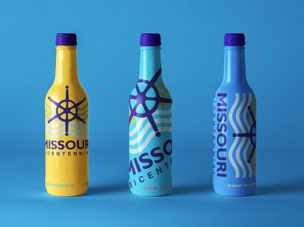
Logoed Dimensional Mockup
As part of this campaign, I designed an imprint for a water bottle dimensional. My focus was on the color blue as it represents water and the many beautiful waterways, big and small, in the state.
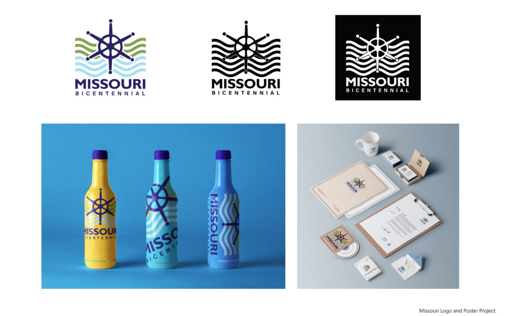
Logo Board Mockups
Here I have mocked up the logo in color and black/white as well as how it might be used in marketing communications.
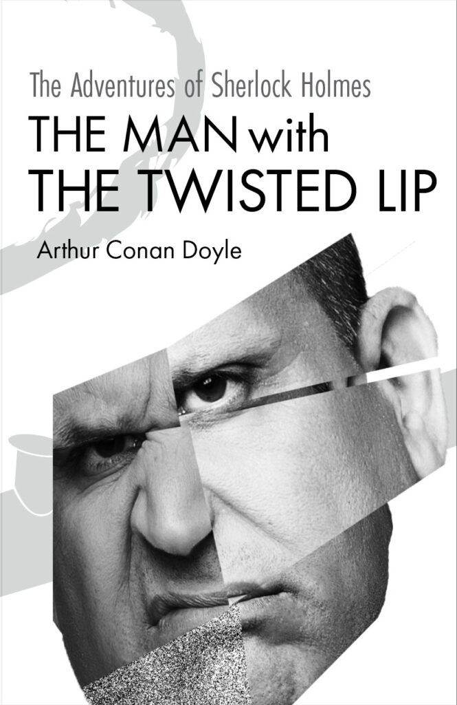
Book Cover Campaign
This campaign was designed as part of a graphic design class. The project was to create book covers for a series of books of your choice. I chose Sherlock Holmes, because as a young reader, I loved the mystery of each story, and how the process to solve the crime unfolded. Still each a great read today!
Book Cover Campaign
I designed a series of four book covers for the popular Sherlock Holmes series of mystery-thrillers by A. Conan Doyle. I used a black/white design to highlight the dark clues in each of the crimes which needed to be understood to get to the truth.
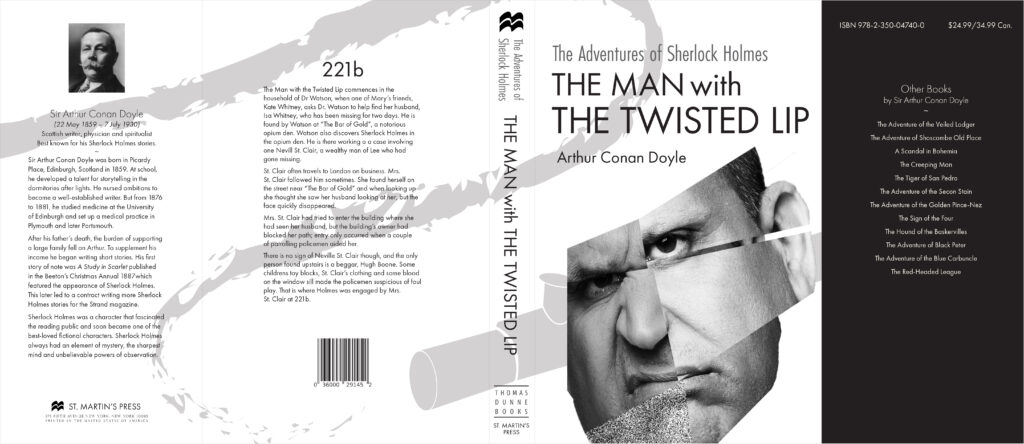
The Man with The Twisted Lip
by Arthur Conan Doyle
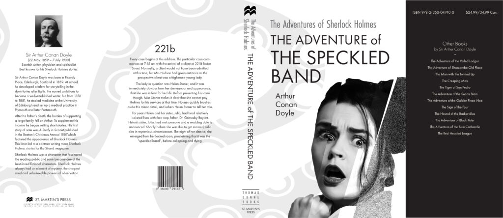
The Adventure of The Speckled Band
by Arthur Conan Doyle
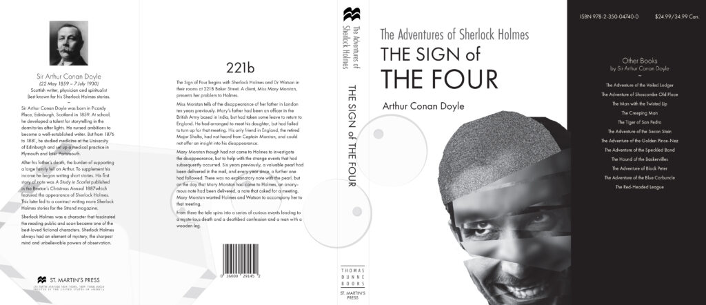
The Sign of The Four
by Arthur Conan Doyle
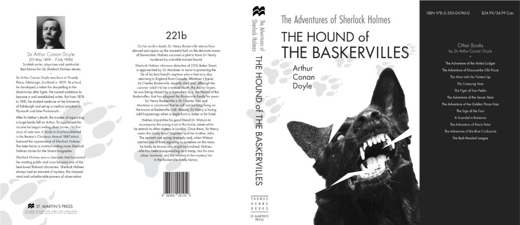
The Hound of The Baskervilles
by Arthur Conan Doyle
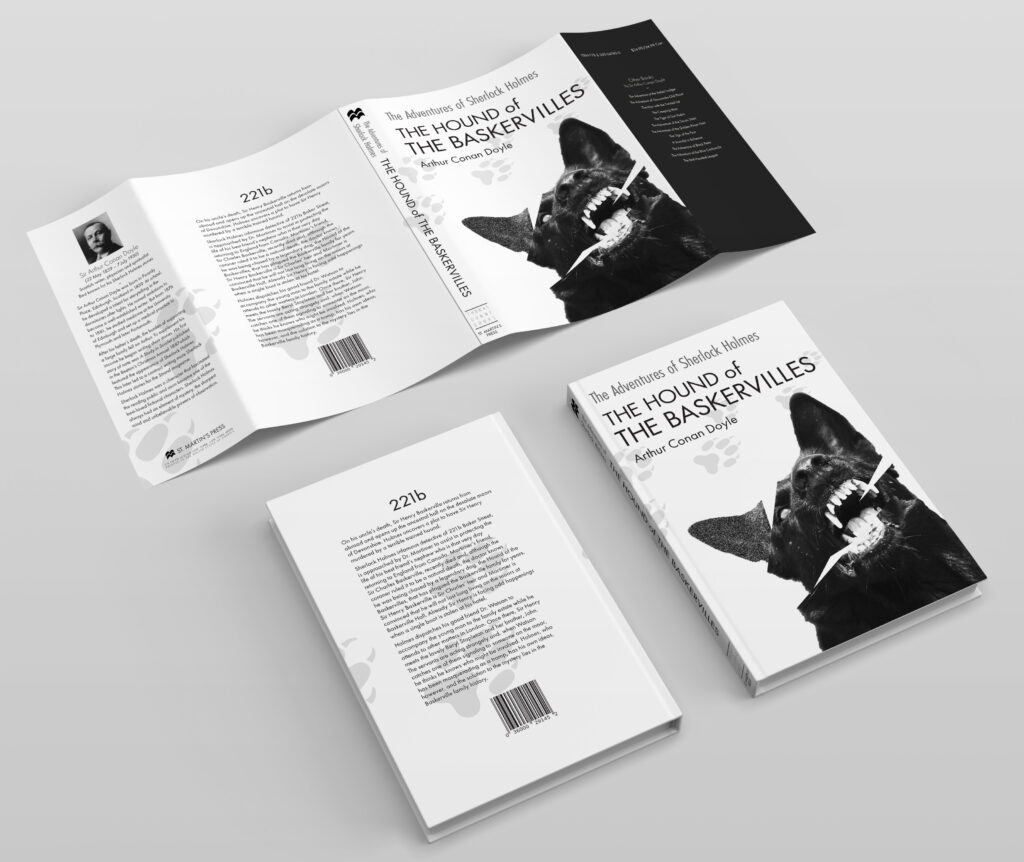
Book Cover Mockup
The Hound of The Baskervilles
Package Design and Branding
This was part of a graphics design class assignment which involved the development of a package featuring strong brand identity through logo, color and design. My choice was to create a tea company called Mystic Monk Tea and feature their Irish Tea. Other tea line extensions could be developed that would utilize the same logo but different colors.
Teabag Tab Design
Mystic Monk Irish Tea
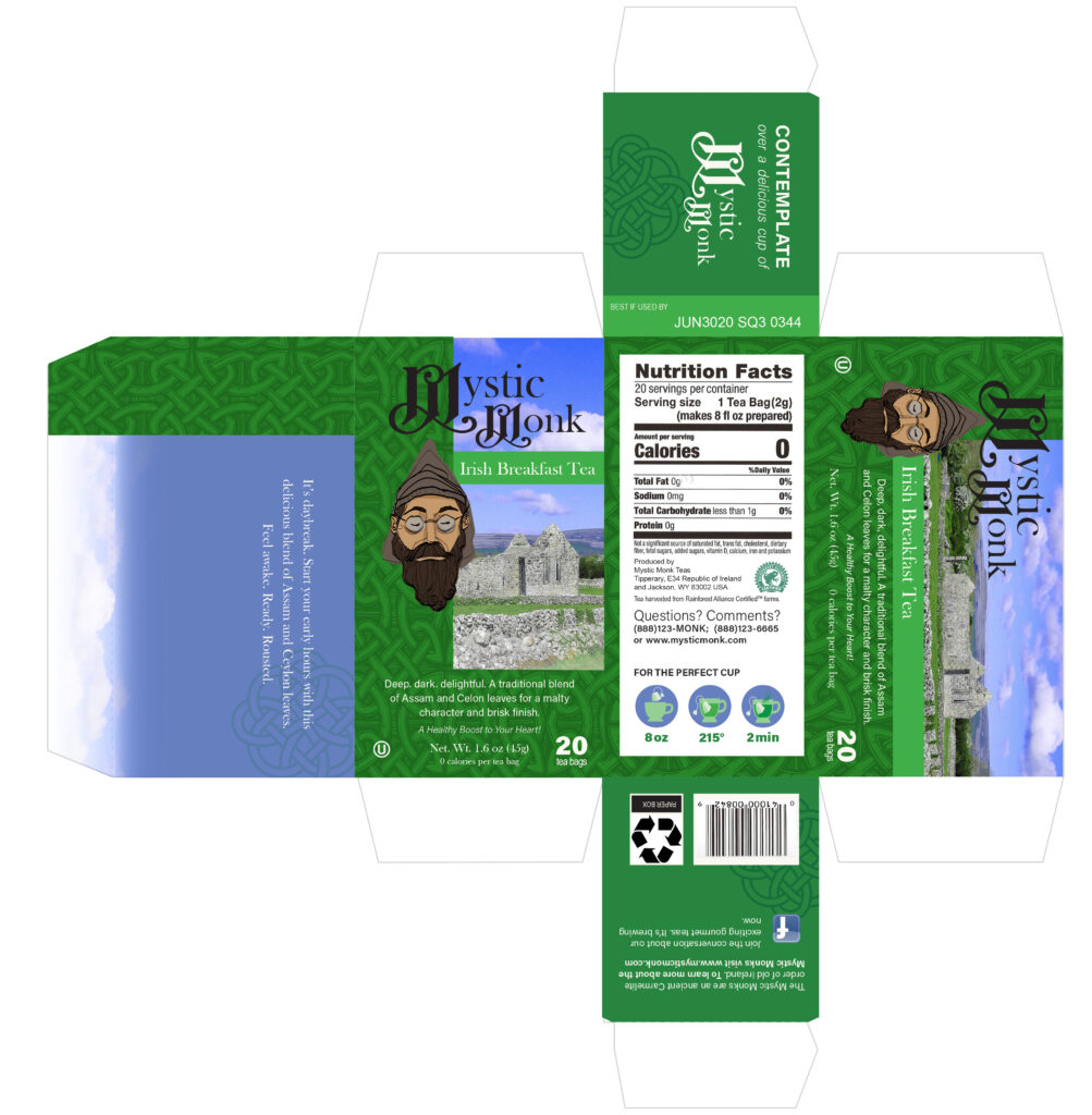
Package Design
Mystic Monk Irish Tea
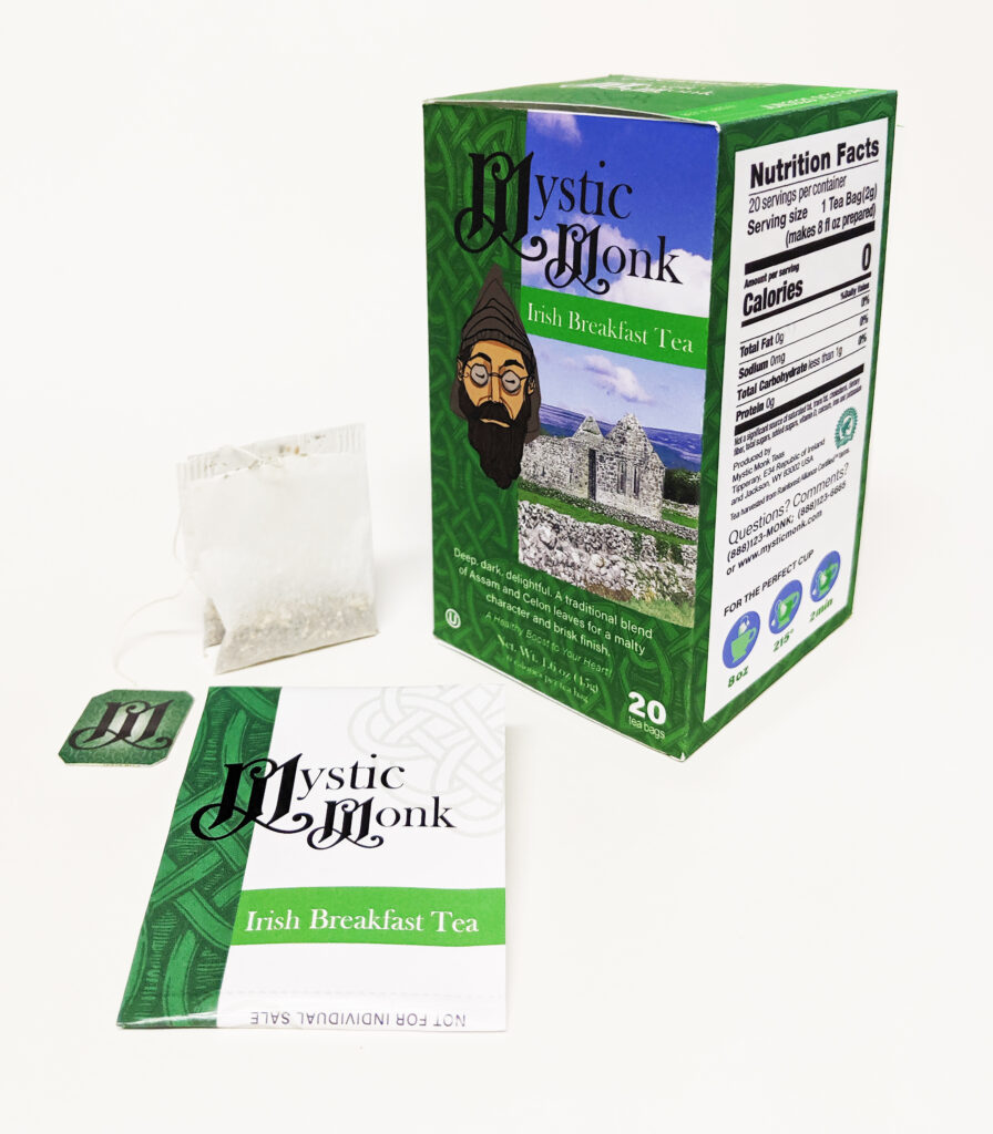
Product Photo
Product photo for the Irish Breakfast Tea
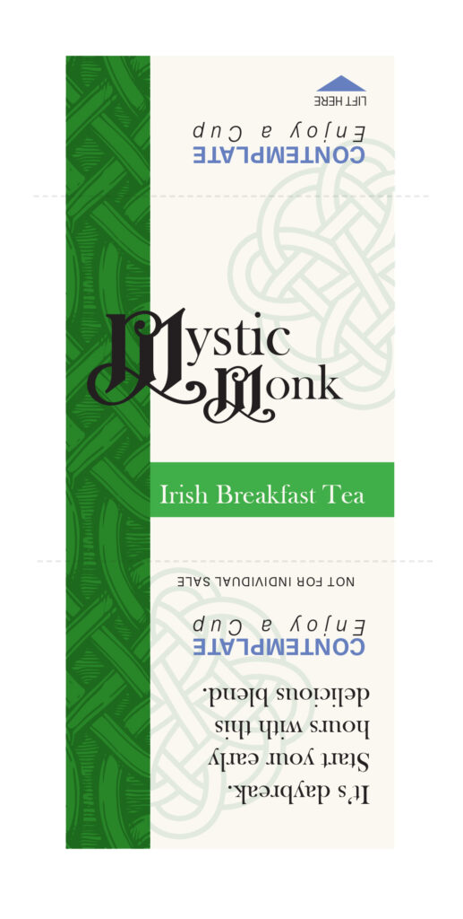
Tea Bag Wrapper
Paper wrapper for the Irish Breakfast Tea
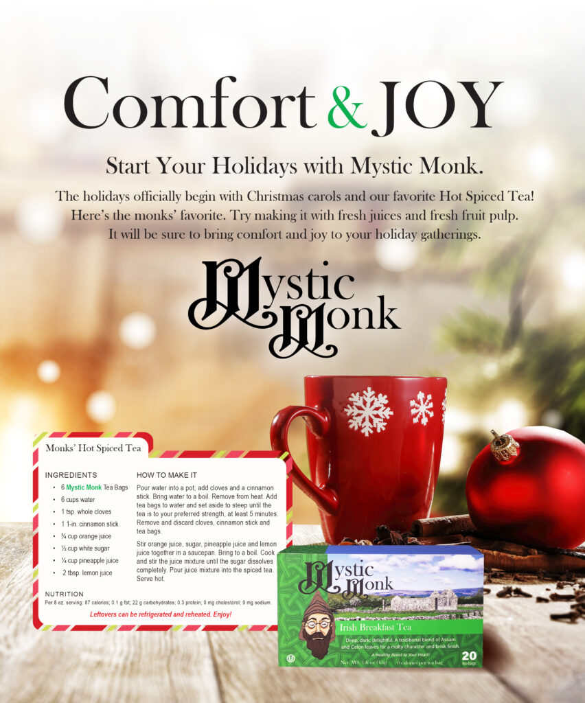
Magazine Ad
As a follow-up to this project, I developed a magazine advertisement that featured the tea packaging.
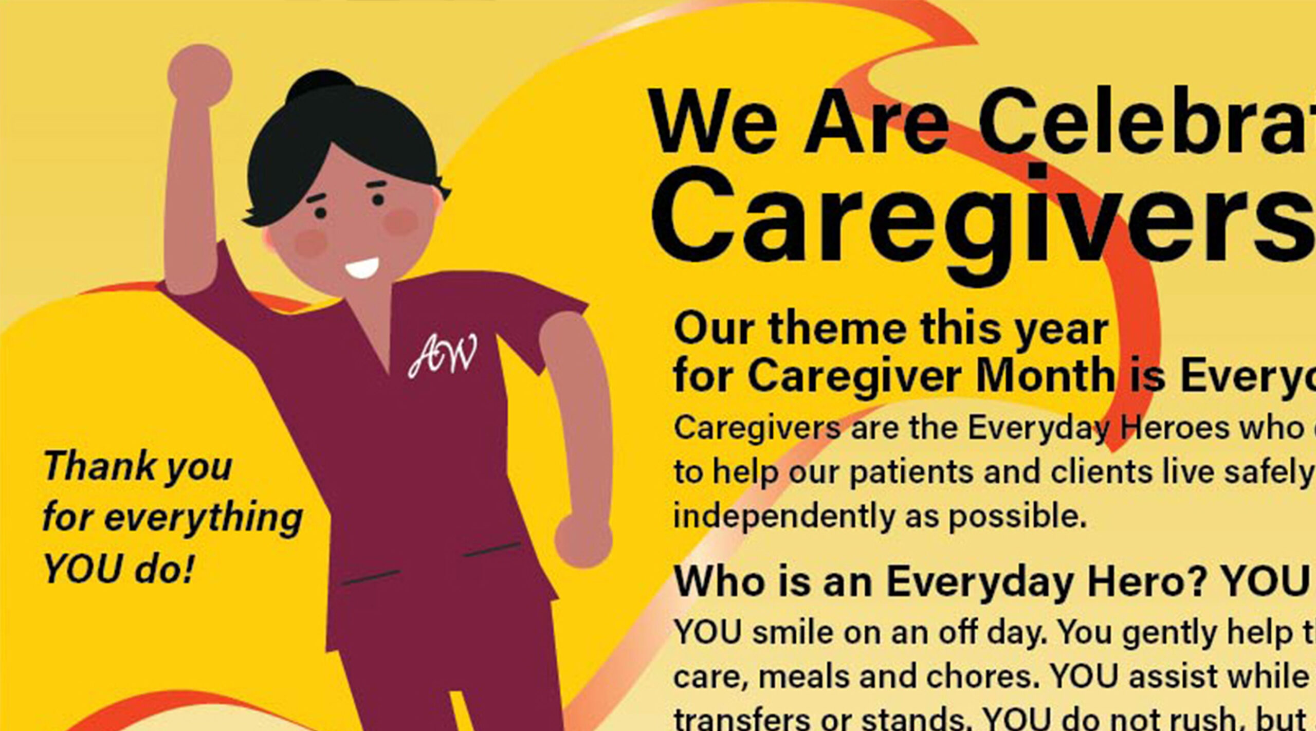
Caregiver Appreciation Campaign
This campaign was designed to promote the annual caregiver appreciation program. The target audience is in-home care caregivers. To grab attention, I designed these printed materials to be bold yet simple.
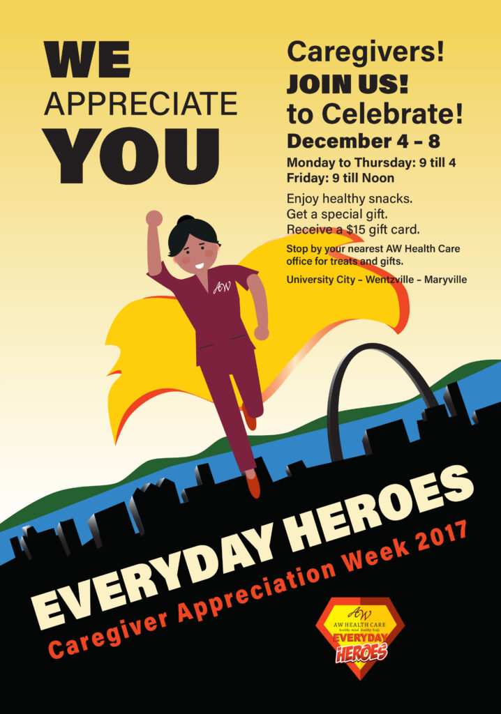
Campaign Poster
This campaign was designed to provide communications vehicles to mobile employees to promote appreciation and awareness.
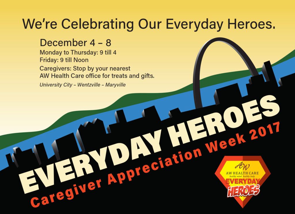
Campaign Postcard
Postcard invitation/reminder design for mailing to homes.
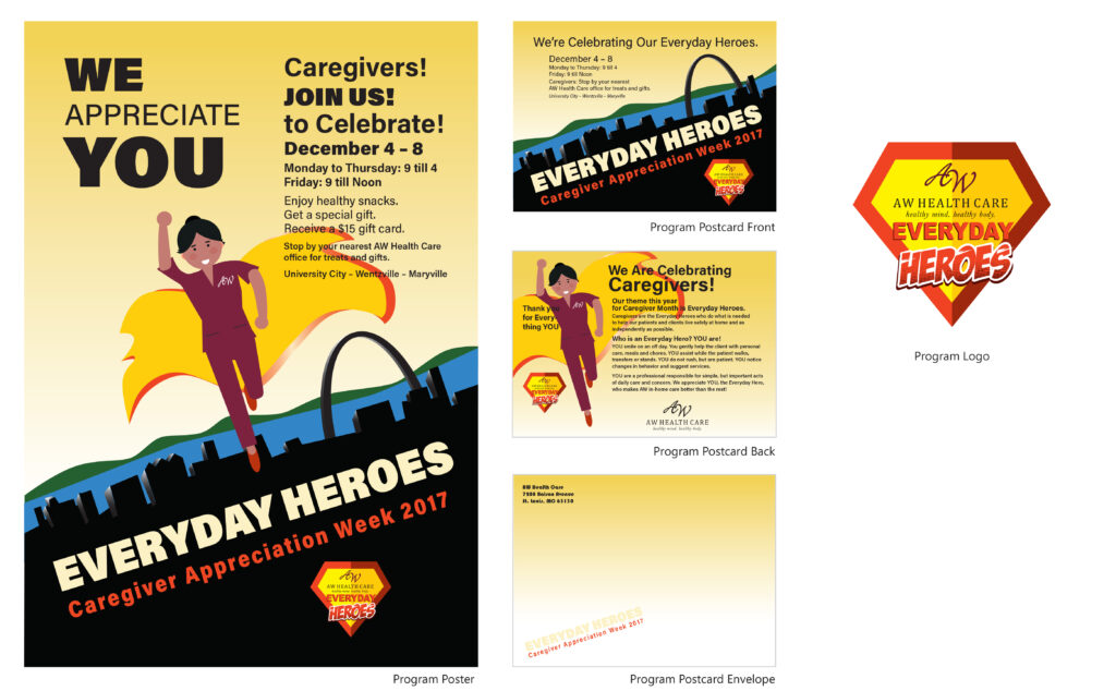
Display Board
This shows the campaign materials for the Everyday Heroes Caregiver Appreciation Program. I utilized bright, eye-catching colors, bold typeface and simple graphics. I created these materials with Illustrator and InDesign.